
Giving a new local cleaning business a spruce.
The Challenge
A friend of our studio, Ryan, reached out for help launching a new power-washing business. He needed assistance with creating his brand and getting his web presence off the ground so he could start finding clients in the Eugene, Oregon, area.


The Solution
We worked together to build a brand strategy, with the first step being determining a business name. We came up with Spruce Street Cleaning, a name with a friendly, neighborly tone and a double meaning between the spruce tree and the word “spruce,” which means to neaten or tidy something up. Once we knew the name, we were able to pivot our focus to making a logo mark and icon and taking some photos so Spruce Street Cleaning would have everything it needed to set up its initial digital presence.

The Executions
We collaborated with Spruce Street Cleaning to design a simple, friendly logo that utilized the namesake spruce tree and carried a playful, inviting, and trustworthy font.


Oregon, and Eugene in particular, is famous for its association with the great outdoors, and we felt the spruce tree communicated that local feeling.


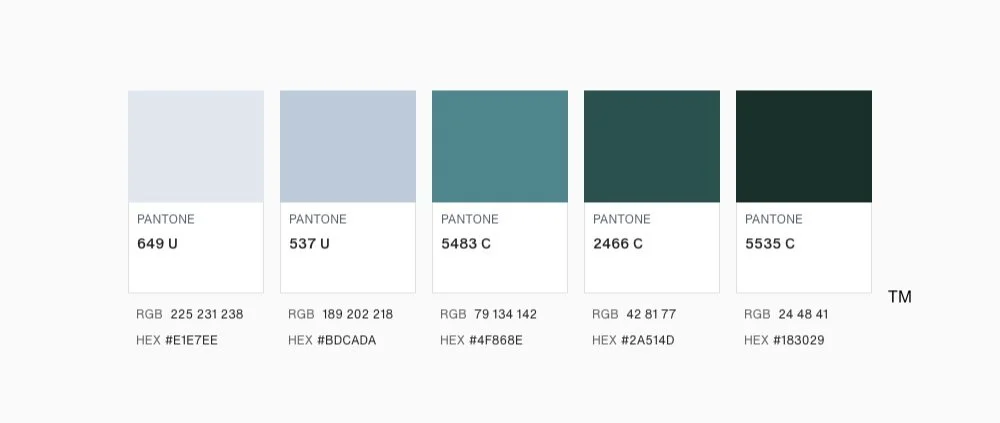
We knew we wanted to avoid a color palette that leaned too heavily on the shades of green or blue that have become a cliche in the cleaning industry and focused more on a dark evergreen and teal color scheme instead.
We created an informative website that feels simple and friendly for new customers to navigate. Spruce Street Cleaning seeks to attract residential and commercial clients, so we created sections for both service types so everyone can easily find what they are looking for. We also sourced stock photography to help round out the pages. In addition to the main pages, we utilized AI to assist in writing a few blog posts to give Spruce Street Cleaning an initial SEO boost.


